My Hero images on Hive Listing are not adjusting for mobile. Will this code as a Snippet fix the issue?
"If your main hero image isn’t resizing properly for mobile, you likely need to adjust its width, height, and background properties. Try adding this CSS snippet:
/* Ensure the hero section scales properly */
.header-hero {
    background-size: cover !important;
    background-position: center !important;
    width: 100% !important;
}

/* Adjust height for mobile */
@media screen and (max-width: 768px) {
    .header-hero {
        height: auto !important;
        min-height: 250px; /* Adjust as needed */
    }
}
This ensures:
The hero image scales properly instead of being cut off.
It covers the full width of the screen.
On mobile, it automatically adjusts its height while maintaining visibility.
If the issue persists, check how the hero image is set in Gutenberg. Is it a background image of a container, or an inline image block? The fix might depend on that. Let me know how it’s set up!"
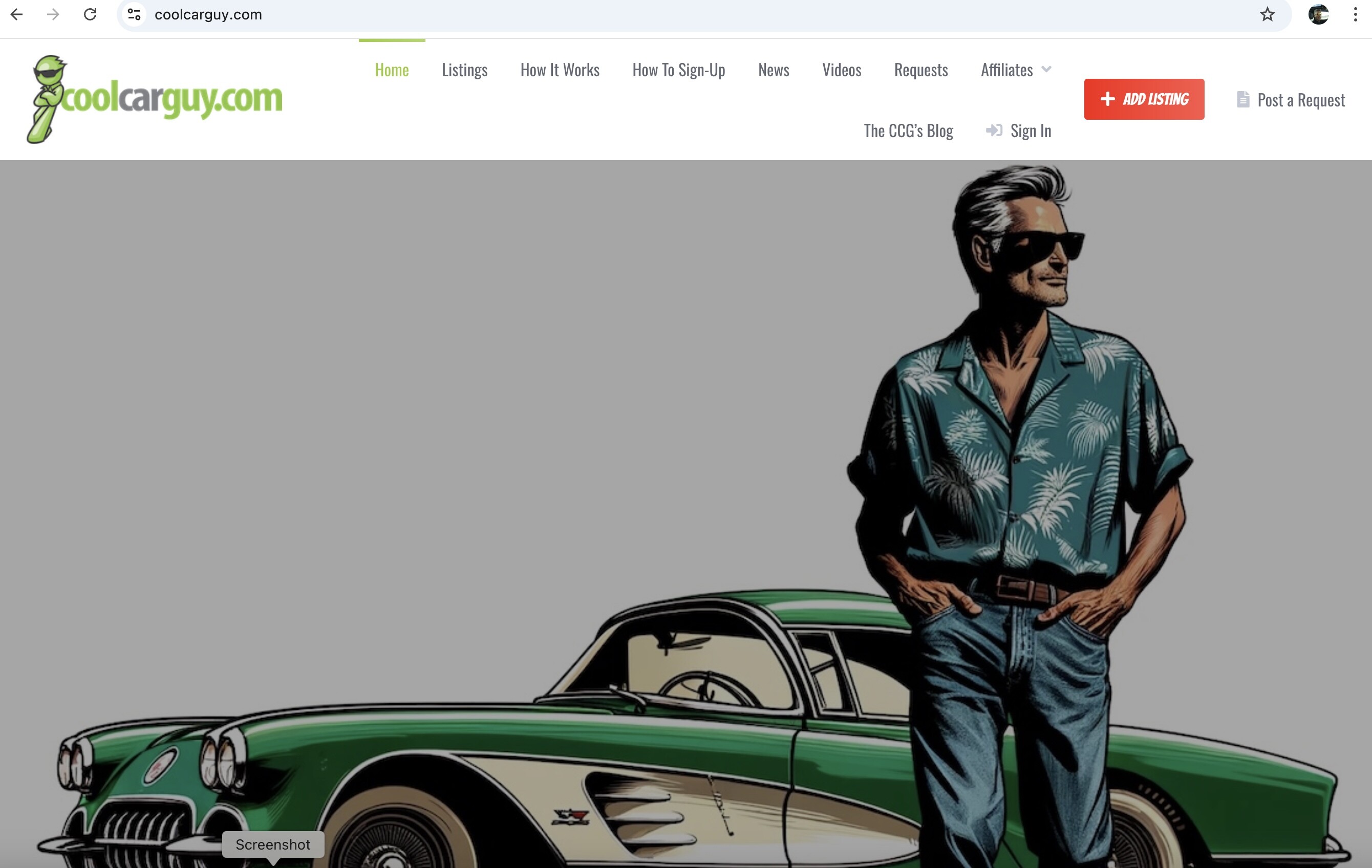
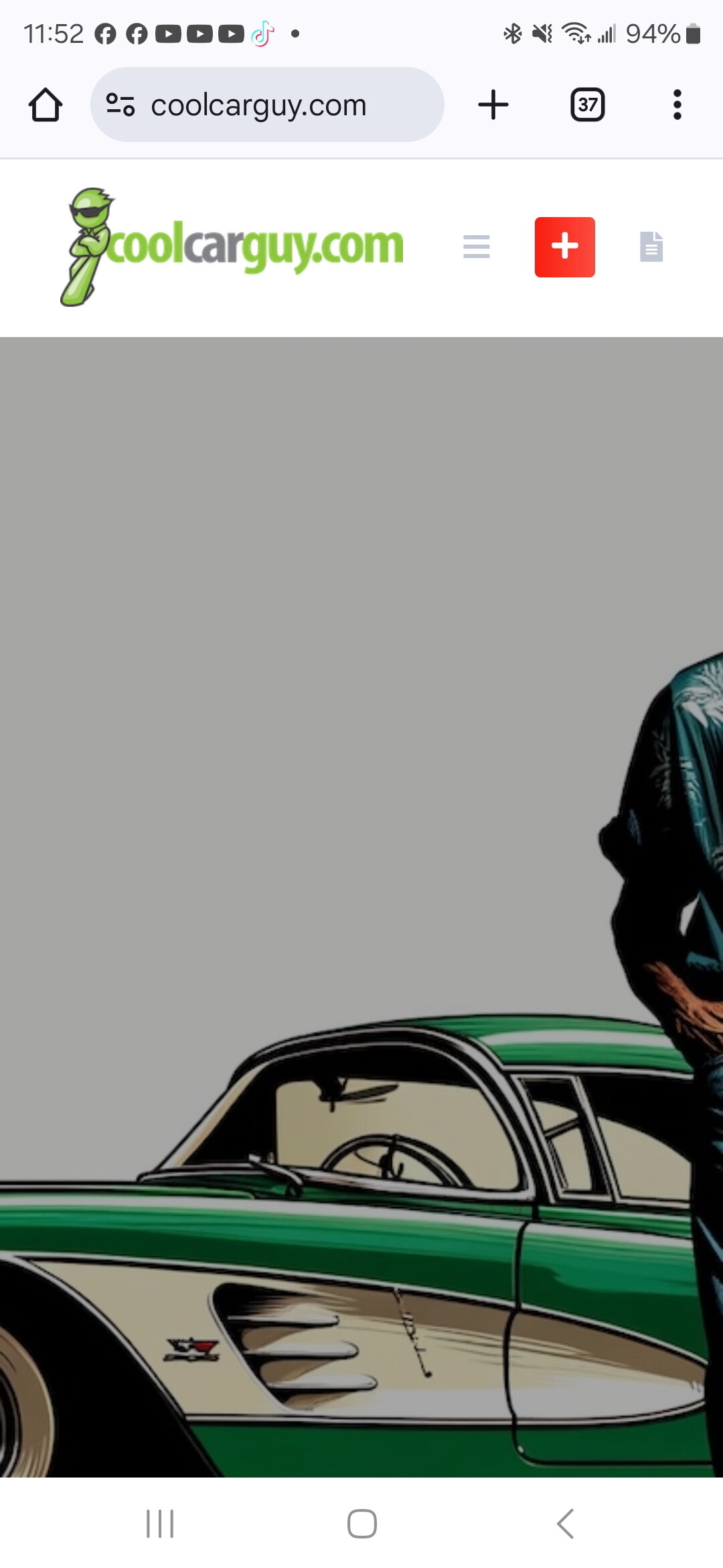
Here are the screenshots of both mobile and desktop for my website and the Hero image is not resizing when on a mobile device. We have a SPACER under Main image with the —more—, so it should be resizing for the mobile device, but it’s not resizing. You can see the images. Please advise how to make it look the same on a mobile or tablet as the desktop.
I was able to fix it using a Code Snippet. If you want me to post it, I’m happy to do so for other people looking for this topic. It is now formatted properly for mobile, tablet and desktop devices, so that the Hero image isn’t cut off.
I had an issue with the main Hero Image not resizing properly for mobile and tablet devices on my site CoolCarGuy.com. Since I wanted the image to take up a large portion of the screen without writing text over it, like the standard way to increase the image size, I used a spacer and the ----more---- function in Gutenberg. However, the image was getting cut off or not resizing correctly on different devices.
Solution: Code Snippet to Fix Hero Image Resizing
To fix this, I used a Code Snippet that runs only on the front-end. This snippet adjusts the Hero Image height dynamically based on the screen size, ensuring it looks great on desktop, tablet, and mobile. You may need to adjust your image size accordingly for the gray background on mobile devices from the spacer, but it worked for my site.
Here’s the Code Snippet I Used:
add_action('wp_head', function() {
    echo '<style>
    /* Default (Desktop) - Adjust height for full visibility */
    .header-hero {
        background-size: cover !important;
        background-position: center !important;
        width: 100% !important;
        height: 800px !important; /* Increased height for full visibility */
    }


    /* Remove the excessive height from spacers */
    .wp-block-spacer {
        height: 0px !important;
        display: none !important;
    }

    /* Tablet (Between Mobile & Desktop) */
    @media screen and (max-width: 1024px) {
        .header-hero {
            height: 600px !important; /* Adjust for tablets */
        }
    }

    /* Mobile - Ensures full visibility without cutting off */
    @media screen and (max-width: 768px) {
        .header-hero {
            height: auto !important;
            min-height: 300px !important; /* Slightly taller for better visibility */
            background-size: contain !important; /* Prevents cropping */
        }
    }
    </style>';
});
Why This Works
Keeps the Hero Image large on desktop (800px height) so it’s not cut off. Adjusts for tablets (600px height) for a smoother transition. Resizes dynamically on mobile, keeping the image fully visible. Removes unnecessary spacers that were adding fixed height issues.
 Keeps the Hero Image large on desktop (800px height) so it’s not cut off.