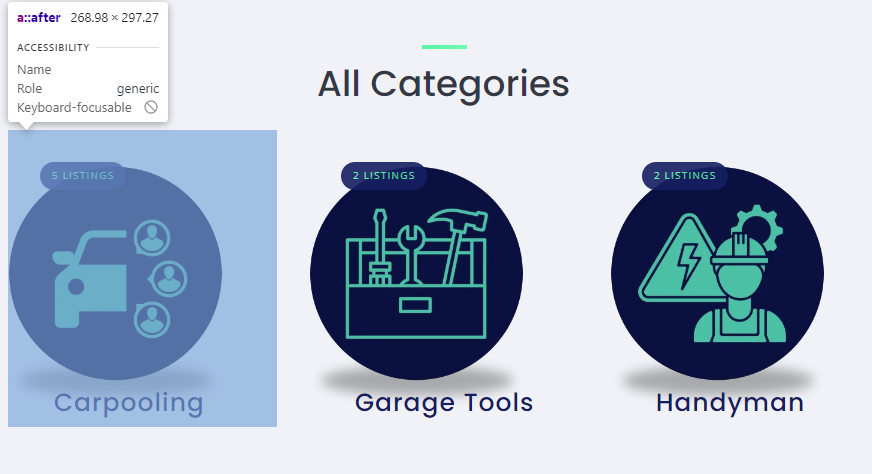
I wanted to have category blocks in same line on mobile device. I have 3 categories and dont have aim to add more categories so it would be better to view them in same line instead of having big category images taking whole space.
It will help users see recent listing without having a need to scroll too much which will improve efficiency.
Sorry for the inconvenience, but customization is beyond our support scope - it includes fixing bugs and guidance about the available features Support Policy | HivePress
If customizations are required for your site, please try customizing it using the collection of code snippets Search · user:hivepress · GitHub and other developer resources, or consider hiring someone for custom work https://fvrr.co/32e7LvY