Change Membership buy plan button?

Good day
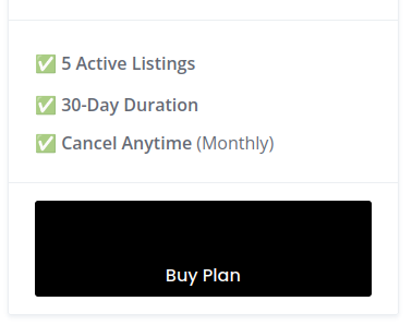
How can I change the button in the Membership?
I wanna have buy plan in the center and bigger.

Is this way to go up to date or do you know a better solution?
https://community.hivepress.io/t/change-buy-now-button-color/9309

Thank you for your help.

Thanks for your message — our team will reply shortly.

In the meantime, you can also get instant help from our AI Assistant, familiar with all the docs and solutions we’ve shared over the years.

Hi,

You can use this snippet and adjust it to your needs:

.hp-membership-plan--view-block .hp-membership-plan__select-button {
  font-size: 1.5rem;
  padding: 1rem 1.75rem;
}

Could you please let me know if you have any customization on your website, as by default, the Buy Plan button is centered.

thank you for your help. I haven’t made any changes, or if I have, I don’t know where.
Could it have been triggered by a plugin such as GTranslate or WooCommerce?

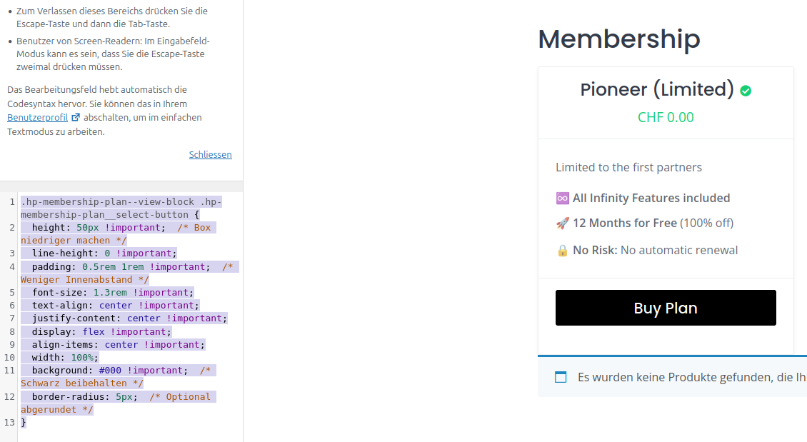
Anyway with this code (generated with Perplexity.ai) it works now :slight_smile:

.hp-membership-plan–view-block .hp-membership-plan__select-button {
height: 50px !important; /* Box niedriger machen /
line-height: 0 !important;
padding: 0.5rem 1rem !important; /
Weniger Innenabstand /
font-size: 1.3rem !important;
text-align: center !important;
justify-content: center !important;
display: flex !important;
align-items: center !important;
width: 100%;
background:
#000 !important; / Schwarz beibehalten /
border-radius: 5px; /
Optional abgerundet */
}

Thanks for the update.

Some plugins can interfere with styling, but there have been no reports of WooCommerce causing this issue, and it’s commonly used together with Memberships. As for GTranslate, it’s possible, but to be sure you’d need to disable it temporarily and check whether it affects the styling.

In any case, I’m glad to hear the issue is resolved. CSS changes shouldn’t impact the site’s performance.
This topic was automatically closed 30 days after the last reply. New replies are no longer allowed.