How can I make a message inbox fitted to view when website is open on a mobile phone?
I have used before that this option (for two columns): Two-column mobile ad page wCSS:
@media only screen and (max-width: 58em) {
    .home .hp-listing .hp-grid__item {flex-basis:50%; max-width:50%; padding: 0.4375rem 0.30rem;}
}
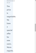
After that my message inbox in mobile looks lik this
Hi,Thank you for fast answear. So, the message window on the phone displays incorrectly (picture above). The message window has changed because I introduced CSS (like above) to alter the appearance on the mobile version. Now I would like to maintain the layout of two columns in the mobile version and change the appearance of the conversation bubble so that it displays horizontally within the phone’s space.
Sorry, there’s no simple code snippet for this, it would require a custom implementation. If customizations beyond the available features are required for your site, please consider hiring someone for custom work https://fvrr.co/32e7LvY