Change related listing collumns

Even after adding the CSS code snippet to style.css in the child theme, I can’t make the changes. What should I do?

@media only screen and (min-width: 48em) .hp-col-sm-3 {
-ms-flex-preferred-size: 25%;
flex-basis: 25%;
max-width: 25%;
}

to

@media only screen and (min-width: 48em) .hp-col-sm-3 {
-ms-flex-preferred-size: 25%;
flex-basis: 20%;
max-width: 20%;
}

Hi,

Please add a CSS snippet using this doc How to add custom code snippets - HivePress Help Center

​I hope this is helpful to you.

Dear Andrey,

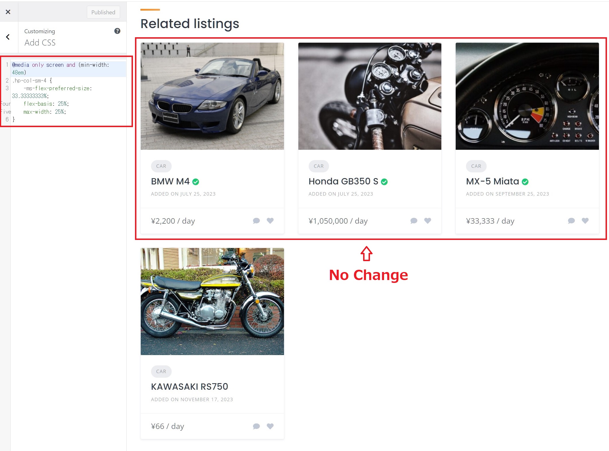
As the homepage is built with blocks, setting the vendor block to column 4 will align four blocks side by side. However, for related listings on the listing page, it remains fixed at column 3.

Therefore, I attempted to change it from:

cssCopy code

@media only screen and (min-width: 48em)
.hp-col-sm-4 {
    -ms-flex-preferred-size: 33.33333333%;
    flex-basis: 33.33333333%;
    max-width: 33.33333333%;
}

to:

cssCopy code

@media only screen and (min-width: 48em)
.hp-col-sm-4 {
    -ms-flex-preferred-size: 25%;
    flex-basis: 25%;
    max-width: 25%%;
}

in accordance with the CSS snippet you provided earlier to switch to four columns. However, upon testing, it appears that the changes are not reflected, perhaps due to the CSS being part of a plugin and therefore, unable to be modified.

Best regards.

Hi,

Sorry, there’s no simple code snippet for this, it would require custom CSS tweaks, please check the samples in this topic How to change number of columns of list of pack on tablet view? - #6 by yevhen

This topic was automatically closed 30 days after the last reply. New replies are no longer allowed.