How can customize the mobile navbar menu with features like a blurred background, non-clickable username, adjusted item spacing, and styled hamburger icon? ![]()
1 Like
The HivePress ListingHive theme comes with a simple and functional navbar burger menu:
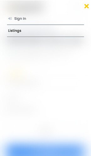
While the default menu works well, it may look too basic for some users. To give it a fresh and modern look, I created a customized version with a blurred background, improved spacing between list items, and more stylish touches:
How to Do It?
Follow these simple steps to transform your mobile navbar menu:
- Add the Code
Copy and paste the CSS code below into your Additional CSS section:
/* General Styles for the Mobile Burger Menu (ShibFox)*/

.header-navbar__burger > ul {
    background-color: #ffffffcc; /* Semi-transparent white */
    -webkit-backdrop-filter: blur(25px); /* Blur effect */
    backdrop-filter: blur(25px);
    padding: 3.5rem 2rem; /* Unified padding */
}

/*Border for  List Items in the Mobile Menu */

.header-navbar__burger ul li {
    border-bottom: 1px solid #394b5d; /* Divider between items */
}

.header-navbar__burger ul li:last-child {
    border-bottom: none; /* Remove bottom border for the last item */
}

/* Link Styling for List Items */

.header-navbar__burger ul li a {
    text-decoration: none;
    color: #000; /* Default text color */
    font-size: 1rem;
    font-weight: 500;
    display: block;
    transition: color 0.3s ease;
}

.header-navbar__burger ul li a:hover {
    color: #ffcc00; /* Highlight on hover */
}

/* Adjust icon size specifically (menu button)*/

.header-navbar__burger a > i.fas.fa-bars {
    font-size: 24px; /* Adjust size */
    color: #000; /* Adjust color */
}

/* Style for menu-item with children (dropdown menu arrow) */

.header-navbar__burger > ul > li.menu-item-has-children::after {
    font-size: 20px;
    padding: 5px;
}

/* Prevent clicking on the user account name link */

.menu-item.menu-item--user-account > a {
    pointer-events: none; /* Disables click functionality */
    cursor: default; /* Changes the cursor to indicate it's not clickable */
}

/* Style for before pseudo-element (Close Button) */

.header-navbar__burger > ul:before {
    color: #ffcc00;
    font-size: 1.8rem;
 margin-right: 20px; /* Add some space from the right edge */
}

/* Adjust padding for smaller screens */

@media only screen and (max-width: 768px) {
    .header-navbar__burger ul li {
        padding: 15px 5px; /* Adjust padding */
    }
}
- Customize Further
You can tweak the colors, font sizes, and spacing to match your website’s theme and style.
That’s It!
With just a few lines of CSS, you can take your mobile navbar menu to the next level. ![]() Try it out and make it truly your own!
Try it out and make it truly your own!
Features added in this menu:
- Blurred Background: A semi-transparent background with a subtle blur effect for a sleek design.
- Disabled Username Clickability: Usernames in the menu are not clickable to prevent navigation issues.
- Custom Icon Styling: Adjusted size and color for the hamburger menu icon to make it more visually appealing.
- Clean Divider Lines: List items have subtle divider lines for better readability.
- Hover Effects: Links change color on hover for interactive feedback.
- Mobile Optimization: Improved padding and layout for better usability on smaller screens.
7 Likes
This topic was automatically closed 30 days after the last reply. New replies are no longer allowed.

