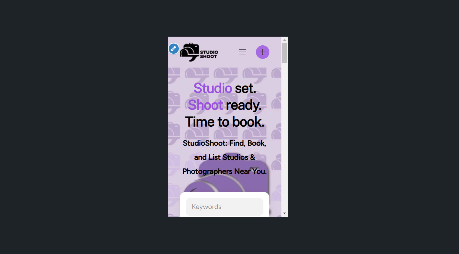
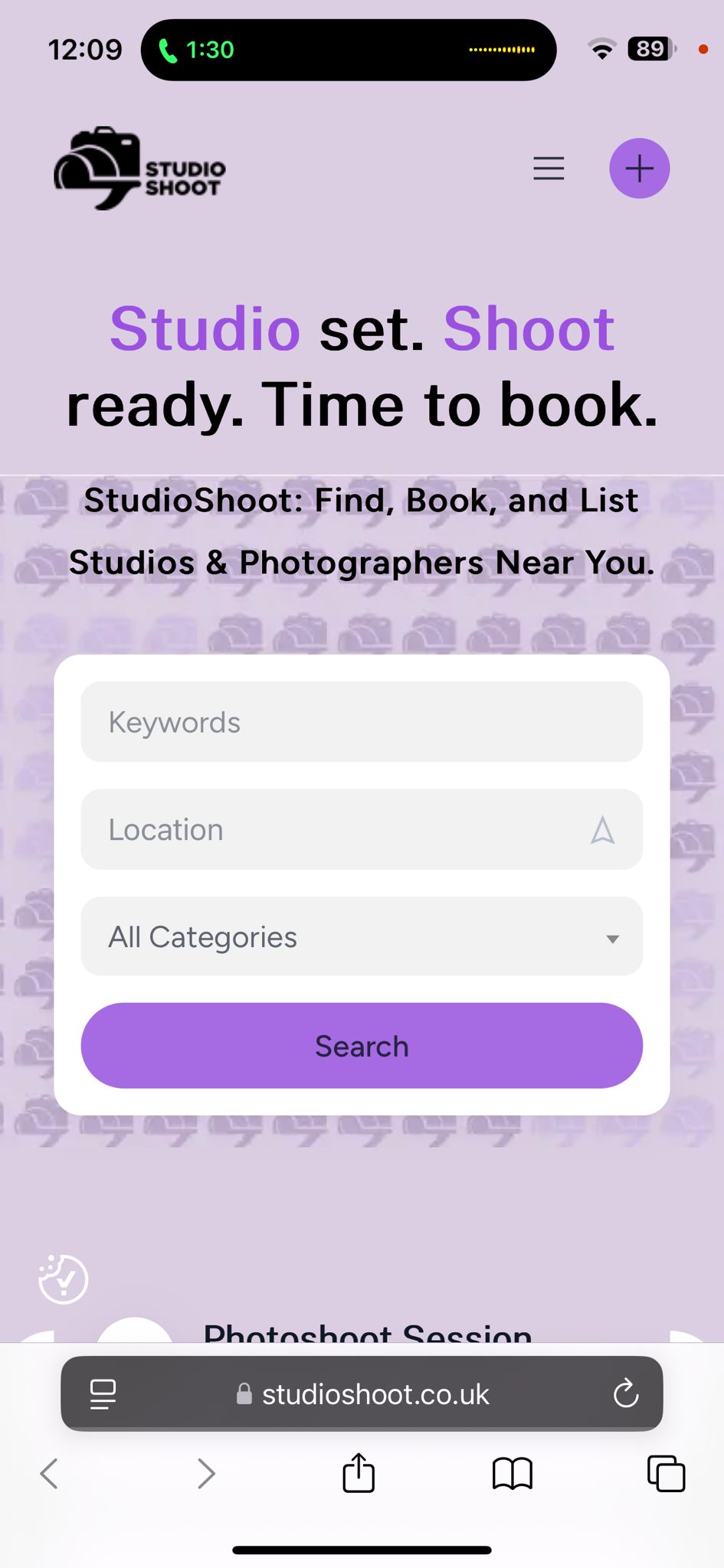
I run into a problem about the way the header image is showing on the phone. When I test the phone view on my laptop it is showing as normal as shown in the first screenshot below. Instead when I use the website on the phone the header image is showing like the second screenshot. (I have tried it with multiple phones and the situation does not seem to change). I have tried with using first an header image with the size that the theme advices to use and with another bigger one, but the issue persists). Could you please help me with this matter?
Thanks in advance.
Please clarify more details, is this image specified in Appearance > Customize > Header? Also, please note that the image covers the header zone in any case, depending on the screen width of the device itself and the content in the header itself. Additionally, please send a link to your website.
Sorry for the delay. Please check if it’s ok now, I also refreshed the CSS cache with disabling the parallax effect and now the background image should always start from the top.
I see. Sorry for the confusion. In the MeetingHive theme, the image is not designed to be full-sized but rather an illustration or elements that are parallaxed in size. If you need the pattern to fill the entire area, we have added CSS in Appearance > Customize, please check if everything is working correctly now.