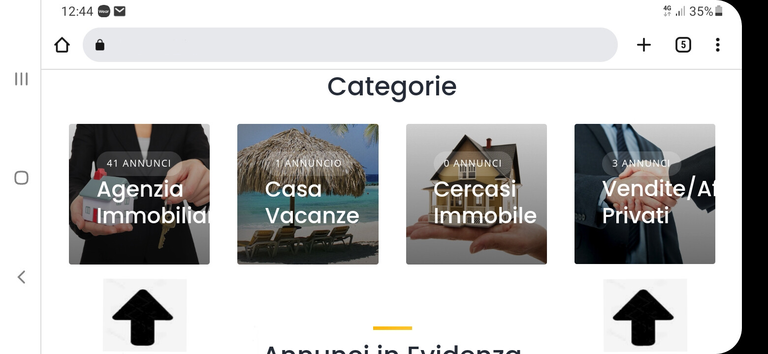
hello, I wanted to show the mobile display horizontally, the internal writings in categories do not fit, they should be reduced a bit, automatically. Can you solve? Thanks for your work and your intervention.
Please let me know which screen width is this, it’s possible to scale the font for it with a simple CSS code snippet.
- 6.4
Please try this CSS snippet but please note that it can require further customization
@media screen and (max-width: 1024px){
	.hp-listing-categories .hp-listing-category__name{
		font-size: 20px;
	}
}
thank you but as an irreversible error, I try again, even with another snippet it gave me an error after three attempts it was accepted.
Please make sure that you added it as a CSS snippet (not PHP via the Code Snippets plugin), the code snippet itself is valid CSS and shouldn’t throw errors.
the Styless-CSS is paid, I tried entering the editor of the child theme it improved a little but still the writings go a little out of the picture, the mobile phone is a galaxy A30s
Font-Size 17px is OK.
The built-in custom CSS editor is free to use, maybe you’re checking some third-party plugin? Please add the suggested CSS snippet in Appearance/Customize/Additional CSS and adjust the 20px value as needed.
This topic was automatically closed 30 days after the last reply. New replies are no longer allowed.