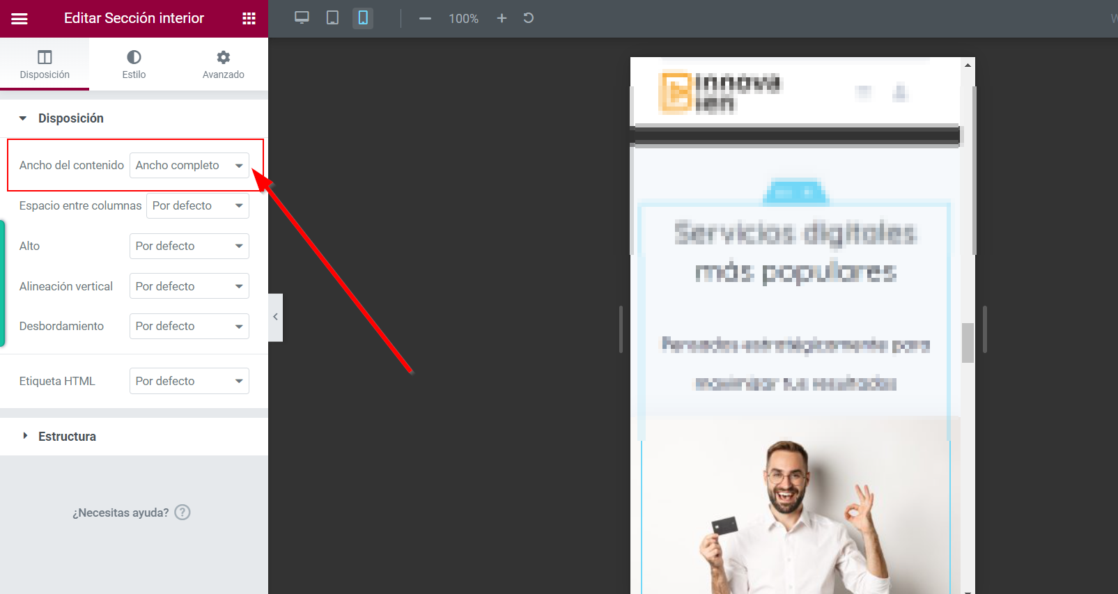
Editing the page and selecting the columns you should see a “stack on mobile” option in the right block panel.
Please try refreshing the page, the listing width will be re-calculated. This issue shouldn’t occur if the page is initially loaded with this page width.
hi as you can see i am using extend container 100% inside elementor. It see good in the visual constructor but when i save the project. it not working in mobile.
This screen testing tool may not work correctly because it changes the screen width with JS, if you check your site on the mobile device it should be ok. If it’s not please send a link to your site and I’ll check this issue (you can send it privately to support@hivepress.io)
yes i send you the credentials, thanks
Hello,
I have the same problem.
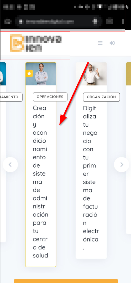
Work well with iPhone 11

But doesn’t with iPhone 12 Pro Max

I’ve have the same issue before but ihor solved it : Responsiveness on listing block | HivePress Support
It doesn’t work anymore since previous update.
Thank you for your help
Thanks for reporting this, the bug is confirmed and we’ll fix it as soon as possible.
2 Likes
This topic was automatically closed 30 days after the last reply. New replies are no longer allowed.