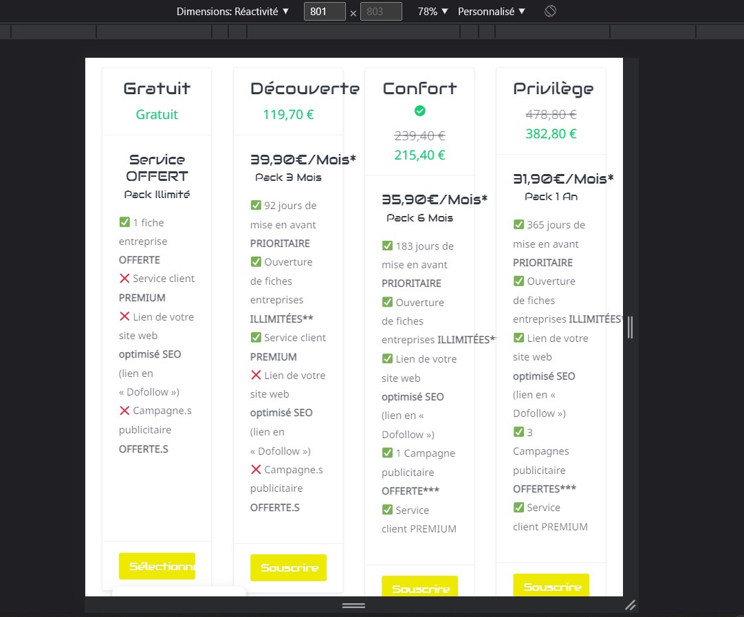
Hi, I noticed that in tablet view mode, the list of paid packs is in 4 columns. Which is not design.
Is it possible to also adjust the number of columns to display on Elementor like for listings and categories?
Hi, I noticed that in tablet view mode, the list of paid packs is in 4 columns. Which is not design.
Is it possible to also adjust the number of columns to display on Elementor like for listings and categories?
The responsive breakpoint for these columns is 768px, please try selecting one of the standard tablets from the list (e.g. iPad) to test this.
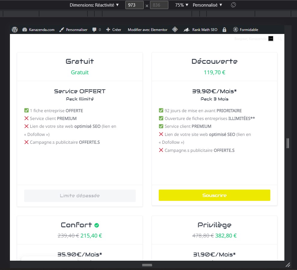
thanks @yevhen , is it possible to put double column from 768px till 974px?
If you are familiar with code customization please try to use @media - CSS: Cascading Style Sheets | MDN to set min-width as 768px and max-width as 974px. Then it is needed to set 50% as flex-basis - CSS: Cascading Style Sheets | MDN and max-width - CSS: Cascading Style Sheets | MDN for each of these blocks in this media rule with a range from 768px to 974px
If you are not familiar with code customization then please consider hiring someone for custom work https://fwd.cx/hLhc73mQCD9R
perfect I succeeded, thank you @yevhen
I leave the code if someone needs it (with the code to increase the height to have the same on all containers)
/*double columns*/
@media screen and (min-width : 768px) and (max-width : 974px){
	.hp-col-sm-3{
		flex-basis:50%;
		max-width:50%;
}}

/*height of containers*/
@media screen and (min-width : 768px) and (max-width : 974px){
.hp-listing-package--view-block .hp-listing-package__content{
	height:23em;
}}
This topic was automatically closed 30 days after the last reply. New replies are no longer allowed.