Location:
On the listing detail page, above the right sidebar profile box (where seller info is shown), add a tabbed section.
 Structure:
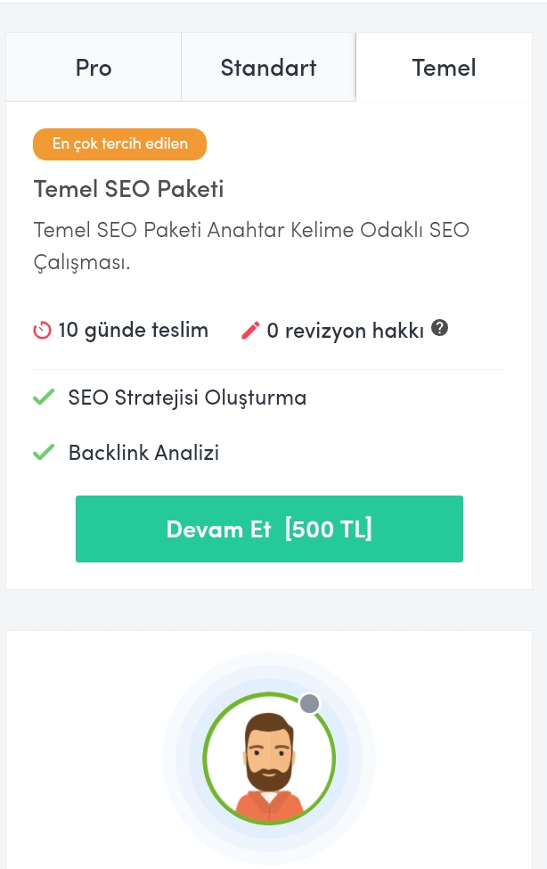
Implement a tab interface allowing users to switch between:
- Packages
- Reviews
- Seller Info (optional)
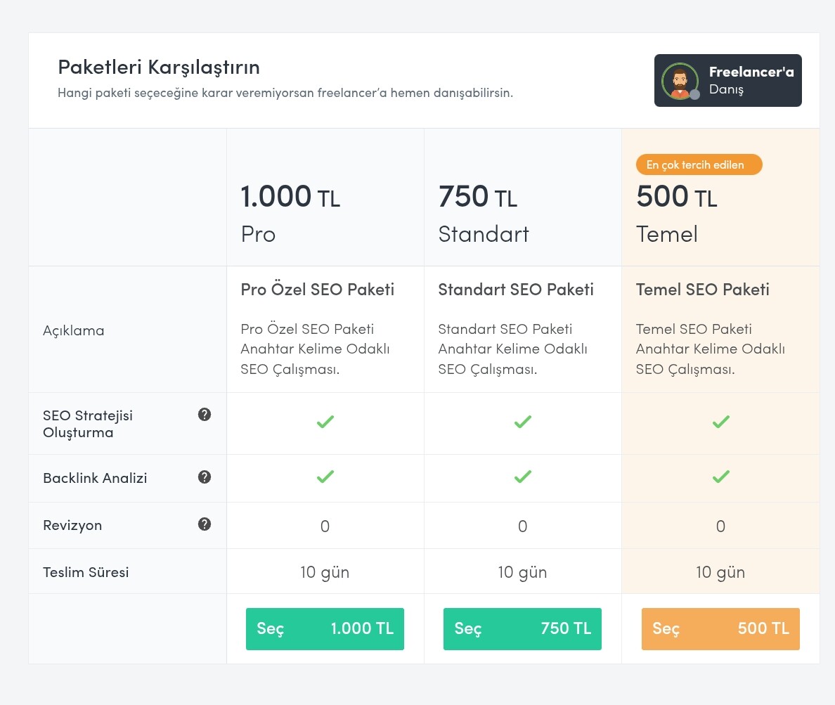
 “Packages” Tab Content:
If the listing owner offers multiple service tiers, they can be clearly displayed here. For example:
| Package | Price | Delivery Time | Features | Revisions |
|---|---|---|---|---|
| Basic | 500 TL | 10 days | SEO Strategy + Backlink Analysis | No |
| Standard | 750 TL | 10 days | + Keyword Research | No |
| Pro | 1000 TL | 10 days | + Competitor Audit + Content Planning | No |
![]() Each package should have a “Continue” or “Select” button to proceed directly with ordering.
Each package should have a “Continue” or “Select” button to proceed directly with ordering.
![]() Add icons and hover effects for better UX.
Add icons and hover effects for better UX.
![]() Mobile layout can switch to accordion view for responsiveness.
Mobile layout can switch to accordion view for responsiveness.
 Value Added:
- Makes comparing service tiers easier for buyers.
- Boosts sales and trust for sellers by showing structured options.
- Offers a more professional, Fiverr-style experience inside HivePress.
 Technical Notes:
- Tabs can be implemented via HivePress template parts, possibly in
single-listing.phpwithin the sidebar block. - Package data can be managed using custom fields or via integration with an add-on.
- Optional: integrate with “Marketplace” or “Requests” extensions for checkout flow.