Hiya,
How can I change the amount of collumns on the listing page on mobile layout. I have received a snippet that works for desktop.
On this page I show categories Aanbod - Motoronderdelen Marktplaats – Onderdelen Kopen en Verkopen
And on this page I show listings Aanbod - Circuit-Motoren.nl - Vind jouw ideale circuitmotor
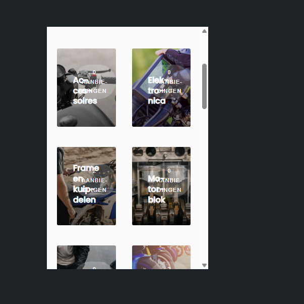
They are both showing a very large picture, Would be nice to see 2 next to eachother to save some space and preserve scrolling 
I tried some css like this
but the text now crosses the images 
@media only screen and (max-width: 768px) {
/\* Zorg voor 2 kolommen \*/
.hp-listing-categories .hp-grid__item,
.hp-categories .hp-grid__item {
flex-basis: 50% !important;
max-width: 50% !important;
}

/\* Titel en overlay teksten kleiner en strakker */
.hp-category–view-block .hp-category__name {
font-size: 0.85rem !important;
line-height: 1.1em !important;
white-space: normal !important; /* laat 2 regels toe \*/
text-overflow: unset !important;
}

.hp-category–view-block .hp-category__count {
font-size: 0.7rem !important;
line-height: 1.1em;
margin-bottom: 2px;
}

/\* Zorg dat teksten netjes binnen de kaart centreren */
.hp-category–view-block .hp-block__content {
padding: 6px 4px !important; /* minder padding \*/
text-align: center;
}

/\* Optioneel: maak afbeeldingen iets hoger voor betere verhouding \*/
.hp-category–view-block .hp-block__image {
min-height: 120px;
object-fit: cover;
}
}