Describe the issue in as much detail as possible.
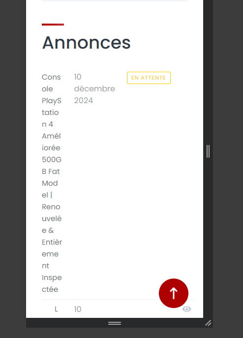
The title of the listing does not display properly on small screens (e.g., 360x680 resolution). Long titles wrap awkwardly and become difficult to read, which negatively impacts the user experience. I would like a solution to ensure the titles are displayed cleanly on smaller devices.
Steps to reproduce
Create a listing with a long title (e.g., “Console PlayStation 4 Améliorée 500GB Fat Model | Renouvelée & Entièrement Inspectée”).
View the site on a mobile device or using a screen resolution of 360x680.
Observe how the title wraps over multiple lines in an unreadable way.
Actual result
The title appears broken across multiple lines, making it difficult to read and negatively impacting the overall design.
Expected result
The title should display properly, either by truncating the text, resizing the font, or implementing clean line breaks for better readability on smaller screens.
Extra details
Here’s a screenshot of the issue:
Let me know if additional information is needed to resolve this issue.
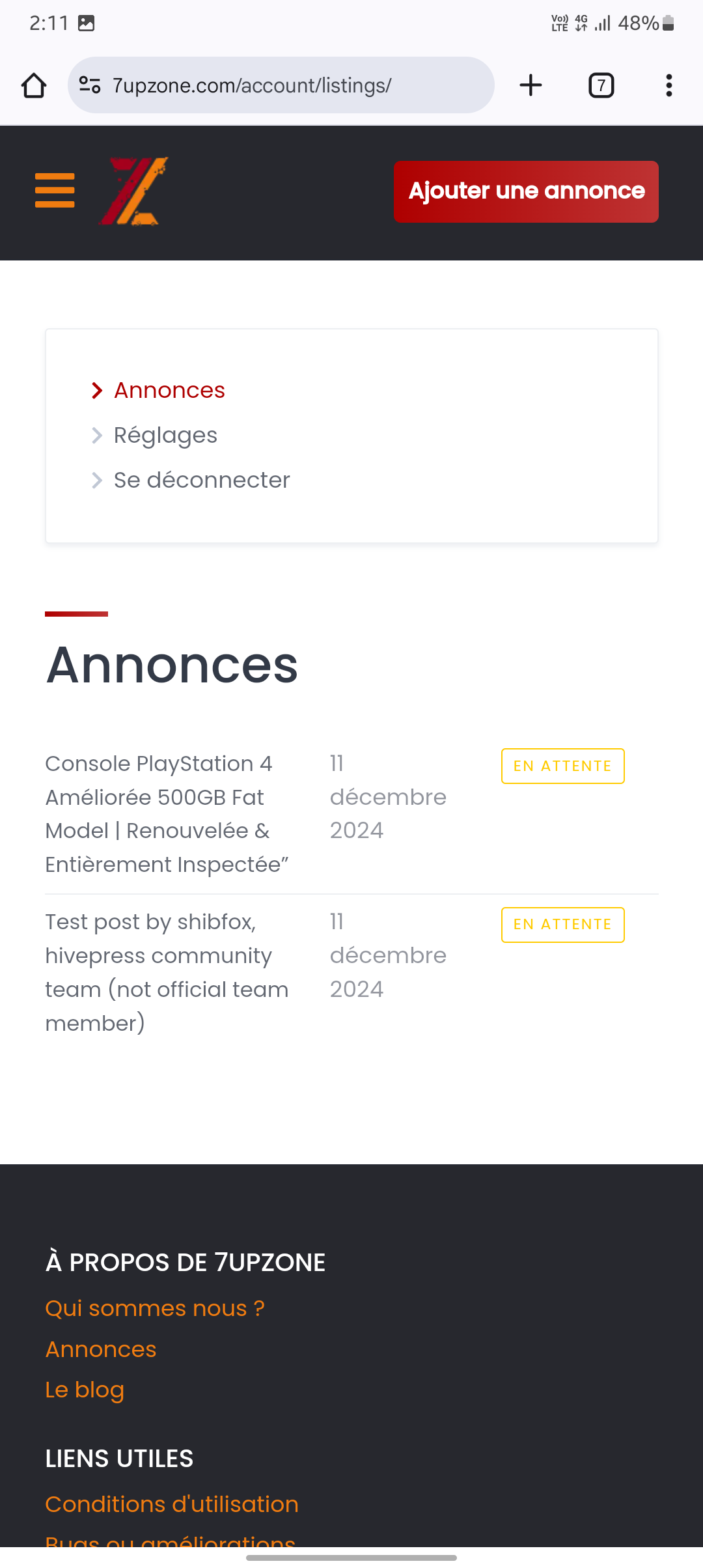
I checked your website, and everything looks great on mobile devices. I suggest viewing it directly on a mobile device instead of relying on theme editors like Elementor or similar tools for mobile previews on a desktop.
Just a note: your website looks pretty good overall!
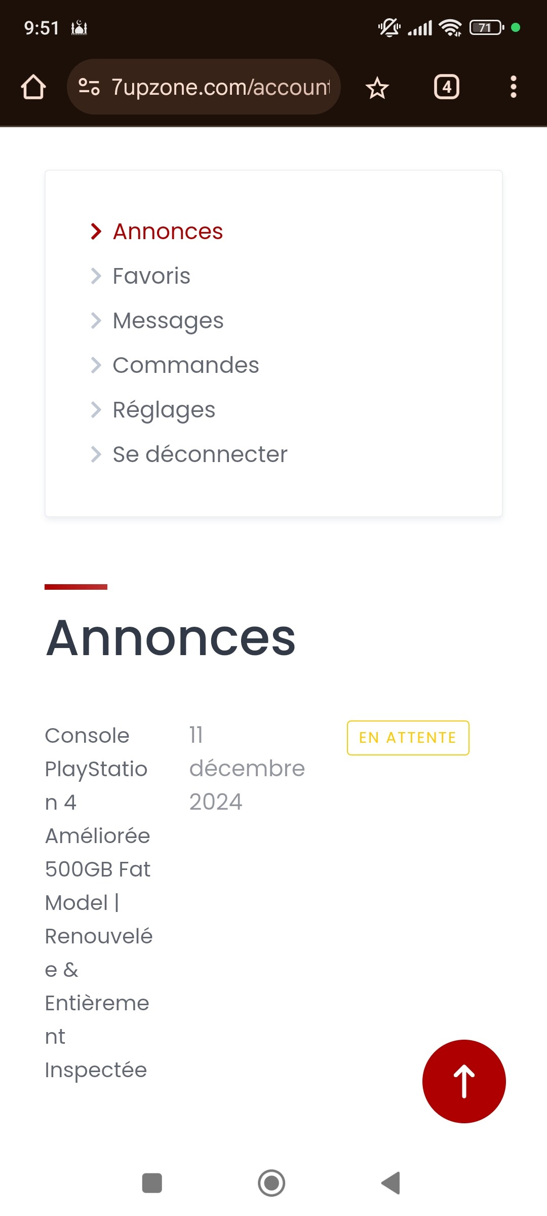
I show you below the display of the page on my phone, and you should know that I use “Hotjar” to view the users’ session and several users encounter the same problem.
To reduce the title length in the editing area specifically on mobile devices, you can use the following CSS in Additional CSS:
@media (max-width: 768px) { /* Adjust the max-width if needed */
.hp-listing--edit-block .hp-listing__title span {
    display: inline-block;
    max-width: 10ch; /* Limit to 10 characters */
    white-space: nowrap; /* Prevent text wrapping */
    overflow: hidden; /* Hide overflowing text */
    text-overflow: ellipsis; /* Add "..." to indicate truncation */
}
This code will ensure the title is shortened and displayed with “…” when it exceeds 10 characters, making it more concise and user-friendly on mobile devices.
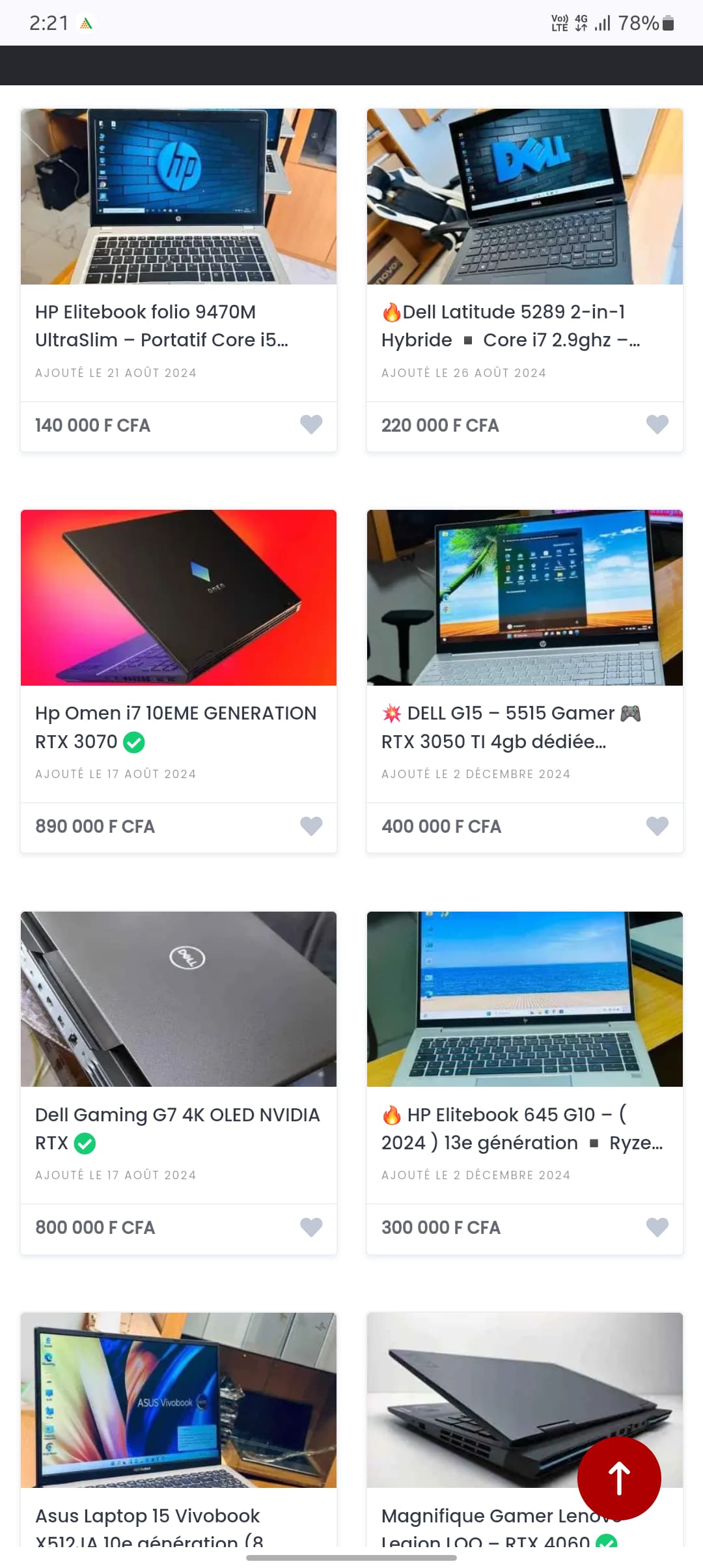
Since the website’s launch in July, I have been actively modifying its design. With the default theme, there was only one listing per row, which I found took up too much space. So, with the help of ChatGPT and some basic web development knowledge, I asked it to display the listings in two columns. Of course, I had to sacrifice some elements to save space and resized the block dimensions.
First, you’ve managed to create an awesome website, it’s pretty amazing!
Second, when I was exploring it, it seems that some kind of Google Ad popped up. How we’re you able to do this? My point is the website is kinda new so how we’re you able to do that?
Thank you so much for the kind words and for taking the time to explore the website—I really appreciate your feedback!
Regarding the Google Ads you saw, I actually just went to the Google AdSense website and followed their instructions to set up ads on the site. However, what you encountered were just tests I was running; the ad option hasn’t been fully activated yet.