Hi sir, what happened to my message inbox? the grid seem to have a problem. What is the proper css code to reset this?

same thing happen in my review block section.
Hi sir, what happened to my message inbox? the grid seem to have a problem. What is the proper css code to reset this?
same thing happen in my review block section.
Hi,
The css class are normally :
.hp-message--view-block{
	(message received)
}
.hp-message--view-block.hp-message--sent{
        (message sent)
}
You may have a margin or width issue here but you can find which one with your inspect tool.
Don’t hesitate to locate your html elements via the inspect tool.
nothing happen by adjusting those classes given. However, when I adjust the grid class as below, the message view back to normal but my entire listing block is affected 
.hp-grid__item {
flex-basis: 100%;
max-width: 100%;
In fact this class take the entire block. But in your first screenshot we can see that not one message but all of them have an issue.
Did you write any CSS codes relative to this part ?
If you didn’t write anything, that’s weird and you may have a plugin conflict…
Do your website is online ? I can go check with the inspect tool and see if there is any codes written which do the issue ?
this is my marketplace website.
Thank you! I appreciates your effort so much.
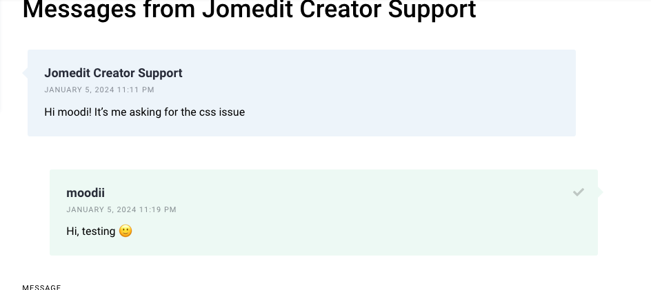
I’m logged, where can I text you to see the page concerned ?
I’m logged as moodii
i have text you in message section
Thanks I’m on it.
In fact it comes from your .hp-grid__item
So it seems that you have a max-width at 25%. So your message bubble is affected by this rule.
I just deactivated it and as you can see your message take the full screen.
Is that what you wanted to fix ?
yes indeed. but when i change the max-width to 100%, it affected the listing block as well…
Okay so this class concern other thinks as well…
Can I have the link to go to the listings where the issue occur as well ?
Did you try to add html up classes ?
Like :
.hp-messages .hp-grid .hp-grid__item{
width: 100%;
}
if I change the .hp-grid__item {max-width:25%, the listing at my homepage (jomedit.com) also affected.
yes i had tried the code below but nothing happened:
.hp-messages .hp-grid .hp-grid__item{
width: 100%;
}
In fact I tried too, your listing grid has the same class.
In my side I did this :
.hp-messages .hp-grid__item{
I tried this in the messages page first : it works, messages width 100%
I tried this in your homepage : This changes doesn’t affect your listing’s width.
Please try to add you width 100% with it .hp-messages .hp-grid__item{ and add an !important rule just in case.
Oh man… it was this code:
.hp-message–view-block {
width: max-content;
}
Now it looks good again!! Thank you for trying to help me out. I really appreciate your consent and effort 
I’m glad you found out the solution 
You’re welcome with pleasure
This topic was automatically closed 30 days after the last reply. New replies are no longer allowed.