I am trying to fix my search bar. In the demo page, it is overlapping the header. This is what I’d like to achieve as well, but after trying to add some additional CSS, I am still not able to do this.
Also, I’d like to have 3 items per row. When I try to customize the listing page, it says it is already set up as 3 items and it’s visible, but my guess is that the sidebar is pushing the 3rd item onto the next row. How can I widen the container so that I can keep the sidebar and still see 3 items per row.
If it’s a Home page, please add this form right after the “Read More” separator, then it’ll overlap the header image section. Based on the screenshot, it seems that you set the same page as the Listings page and the Home page, I recommend creating a custom page in WordPress/Pages for Home, then you can fully edit its content in the editor.
To show 3 columns on the Listings page you can use this snippet Change the columns number on the listing search page #hivepress #listings · GitHub but then listings may not fit in 2/3 of the page width.
Thank you for the reply Ihor. I think you forgot to include the form you are mentioning. When creating a custom page, what should I place in that and how can I seperate the home & listings pages? Thank you for the snippet. I’ll have a go at that
Please try following this screencast to create a custom Home page Adding WordPress Pages [ListingHive Course - 6/11] - YouTube If you set the Listings page as the Home page, it’ll always show the listing search layout. If you create a custom Home page, you can fully edit its content (e.g. show a few listings, categories, search form and other content if required).
Thank you, that solved it. One more question: When on a big screen size, is it possible to widen the container? When I edit the listing page it shows 3 columns of listings per row and good spacing, but this example does not include the sidebar. When this is on the page, the view blocks are being cropped.
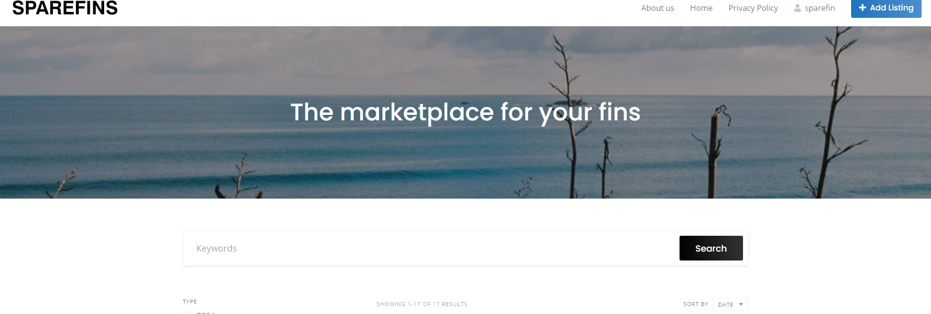
Thank you, that worked. Now I have one last question and that is that my hero image is not visible when i click search on the homepage. But when I go to the listing page directly, the hero is visible. How can I make it that the Hero image is visible when I use the search function on the home page?
The hero section appears on the Home page and listing category pages, but when you click Search or Filter, it’s a regular search page. It may be possible to add a custom header there if you override the listing search template Overview | HivePress Templates - YouTube but please note that this header would take extra scrolling space on every search (especially on mobile) and this may be bad for UX if users already read this header on the home or category pages.