First thank you to the HivePress team. I’ve been building a marketplace site on HivePress + ListingHive, and the plugin gave me a genuinely solid foundation to customize without fighting the core. That’s rare for a directory toolkit at this price point, and I wanted to say so before anything else.
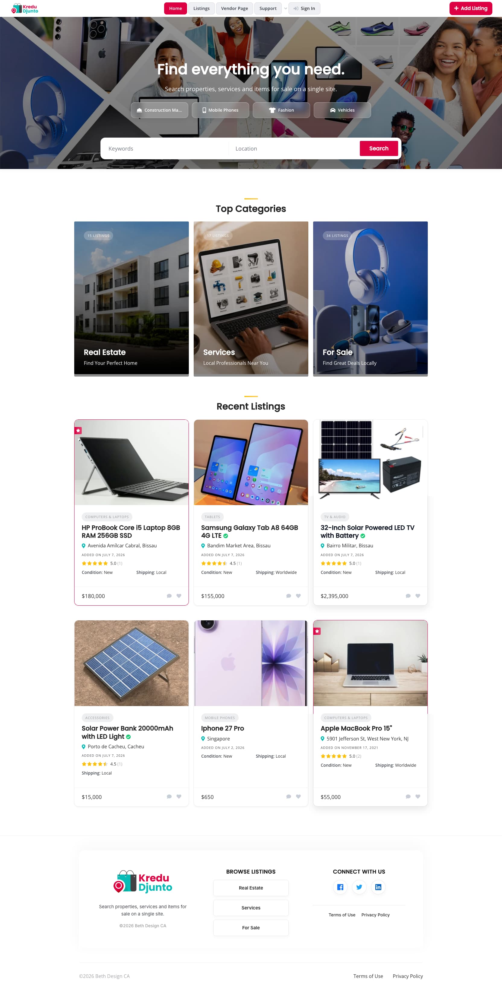
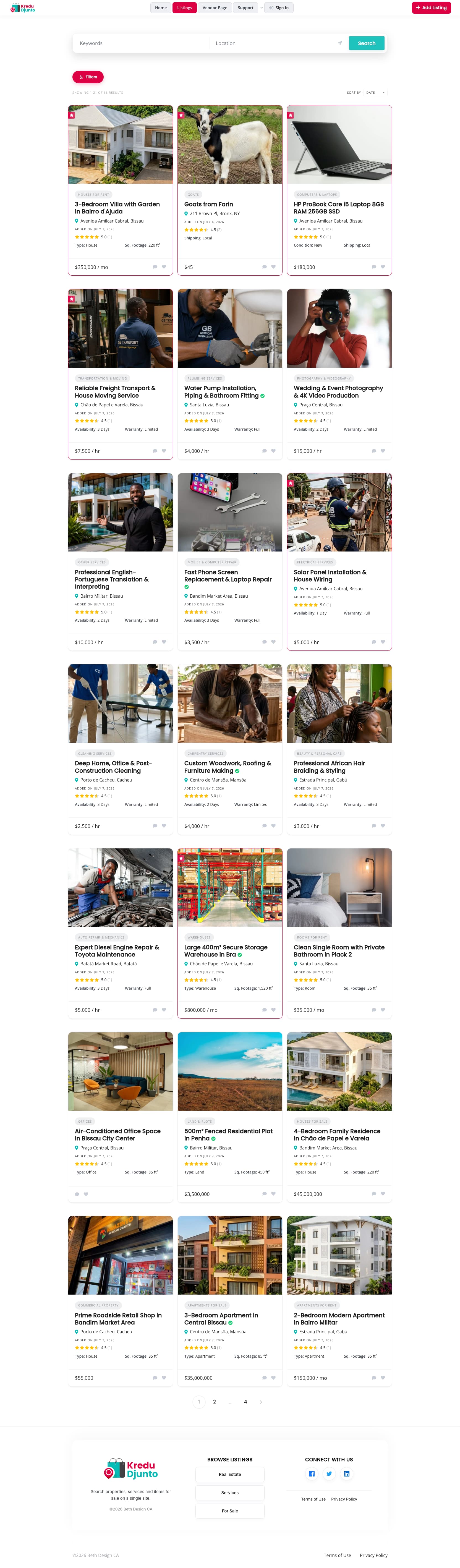
Over the past while, I’ve built a full child theme on top of ListingHive focused entirely on mobile UX and a more premium feel. Some of the core updates include:
Quick-access category buttons and search moved into the hero section
Horizontally scrollable listing rows on the homepage (swipeable, app-like)
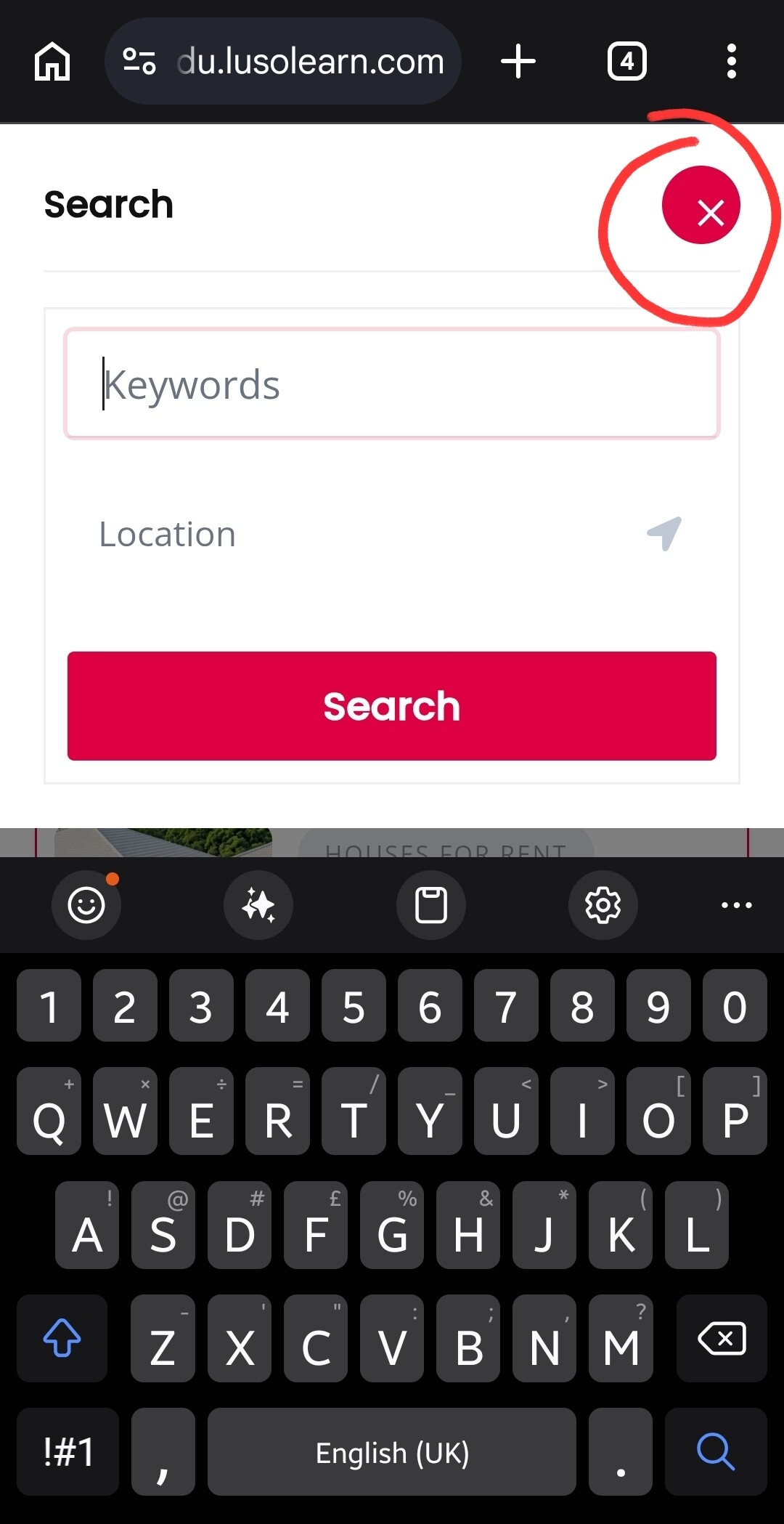
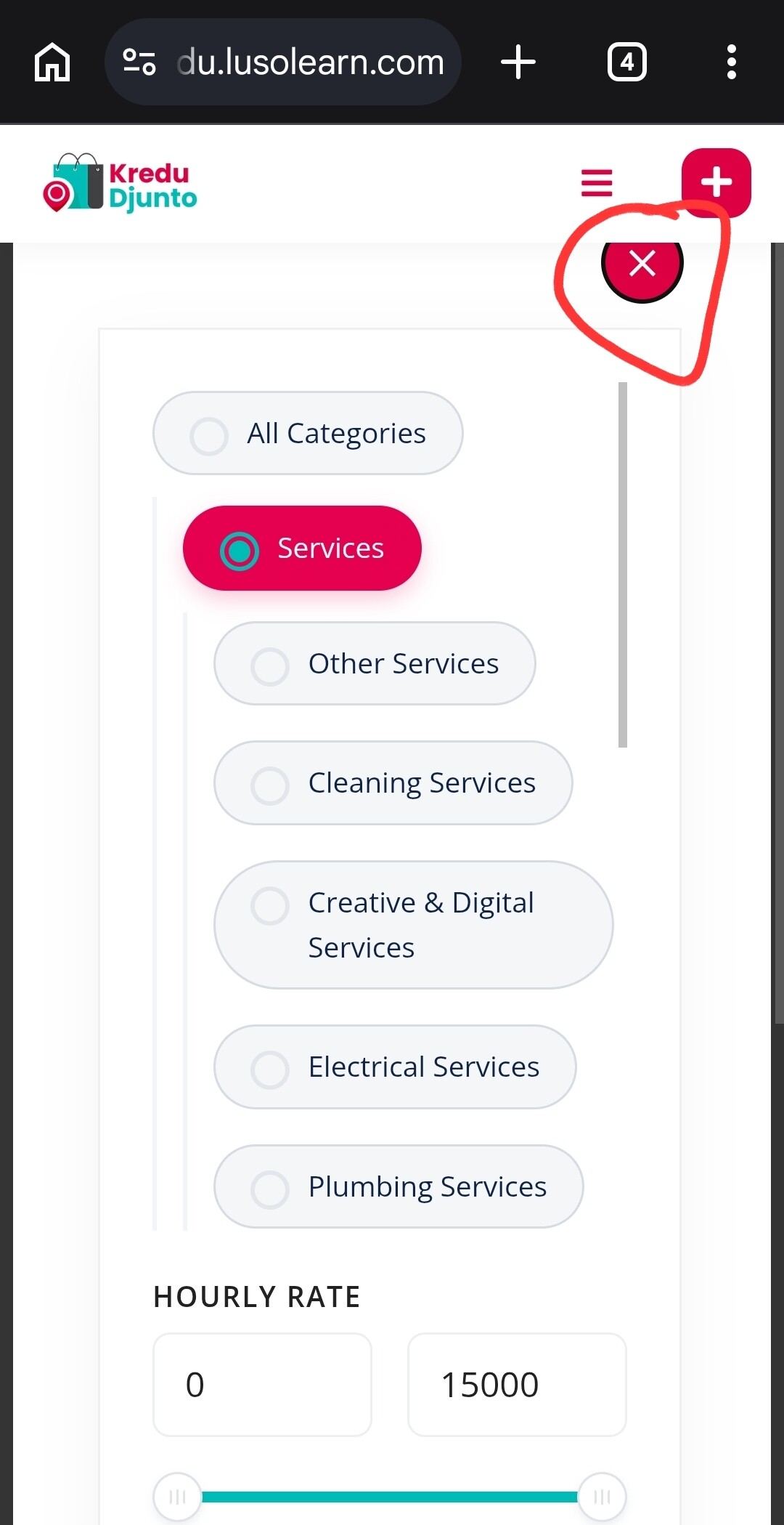
A redesigned filter experience (pill-style chips, an off-canvas drawer on desktop, and a pinned close/apply on the mobile filter modal)
Single listing pages reordered specifically for mobile reading flow
One-tap WhatsApp inquiry that auto-fills the listing title + link
A consolidated, cached JS file (instead of inline scripts) and keyboard-accessible overlays
Everything is built as a proper child theme — no core files were touched, so updates stay safe.
I’d genuinely value feedback from people who know this ecosystem well. What would you want to see in a theme like this, and is there any interest in the community for something like this as a premium option?
Thanks again for building HivePress, happy to answer questions about how any of this was done!
Firstly, many thanks for sharing this with the community. I love when other community members like myself get creative and roll up their sleeves!
And secondly, congratulations on achieving what you’ve managed to do with your child theme! This is really cool to see, and I’m genuinely impressed with how some of this looks/functions.
I’ve only had a chance to look at it on mobile for now, and whilst some parts look really cool and work well, at least on my phone (Galaxy S23 using Chrome), there’s a few things that I feel could still be tweaked further to help give it a professional finish.
For example:
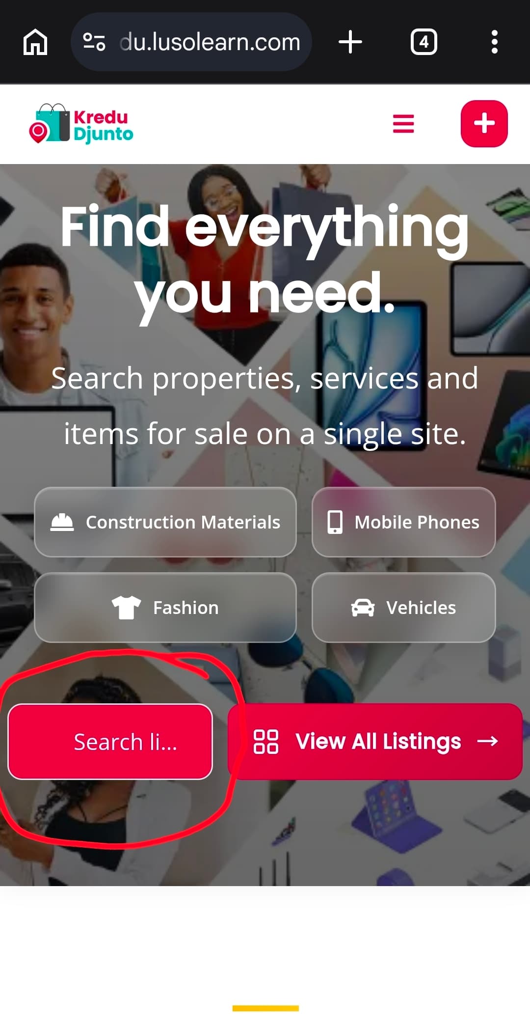
Overall, the header looks great and I love all of the above the fold options as soon as you land on the page. However, on the search field, it looks like there’s a missing or mis-coloured icon, however, I’d also consider losing the icon space altogether, so more of the text is visible before being truncated.
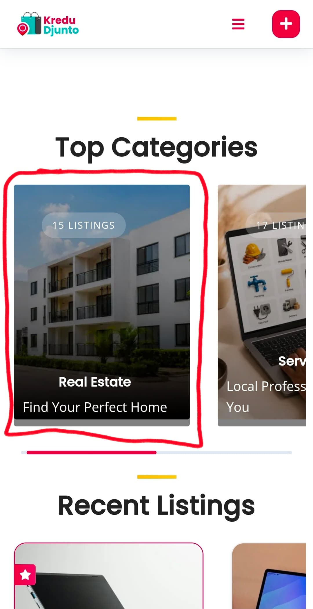
The implementation of the sliders for both the categories and listing blocks are really nice touches. I’d personally love it if you could share a mini tutorial on how to go about achieving this. (In a new topic) However, on the category blocks, the mixture of left and center alignment feels odd. I’d recommend committing to one. Secondly, all of the categories seem to have a weird grey line at the bottom.
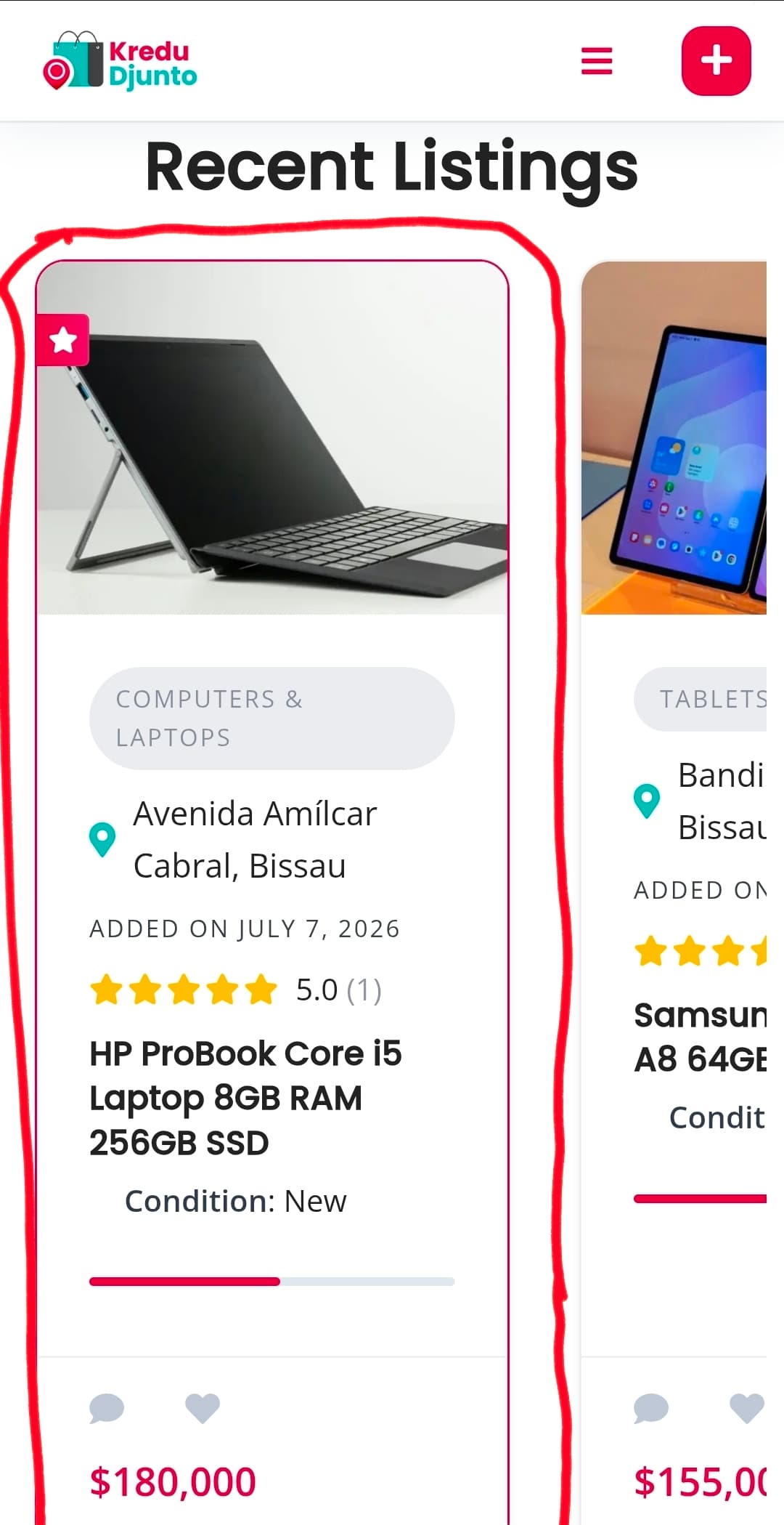
As before, I love the idea, however, I personally feel like the listing cards look like they’re too slim. I know you need to ‘hint’ at the off-screen block, but trying to make the next block slightly less visible might help make everything feel cleaner overall. The ‘tall and skinny’ listing cards just feel off to me for some reason.
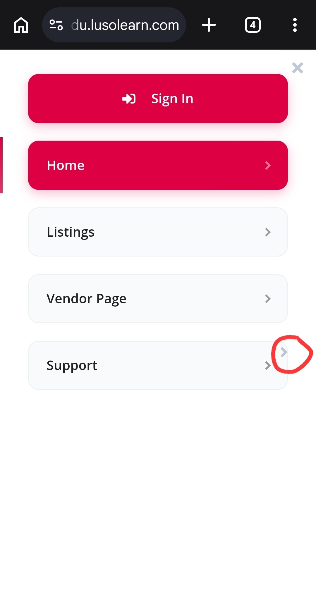
Your updated menu looks great overall and seems to function well, however, I noticed there’s a weird secondary arrow that I think was left behind by the default menu.
(I’m limited to 5 images, but I’ll post more below)
Honestly, though - what you’ve achieved is awesome to see! You’ve made a solid start with this and with a few minor polishes, this is going to be incredibly solid.
I look forward to seeing how this continues to evolve. Do keep us updated on the next version!
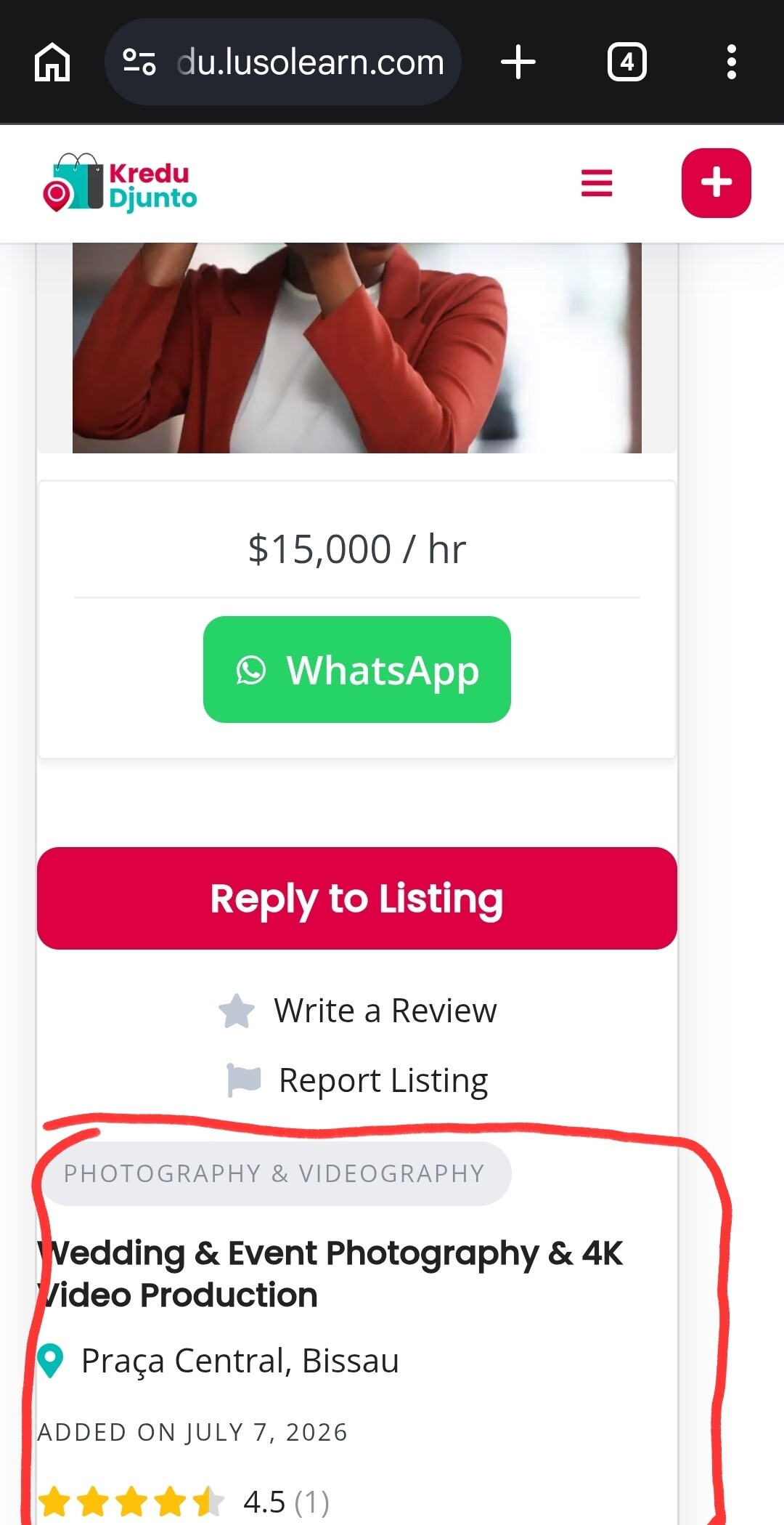
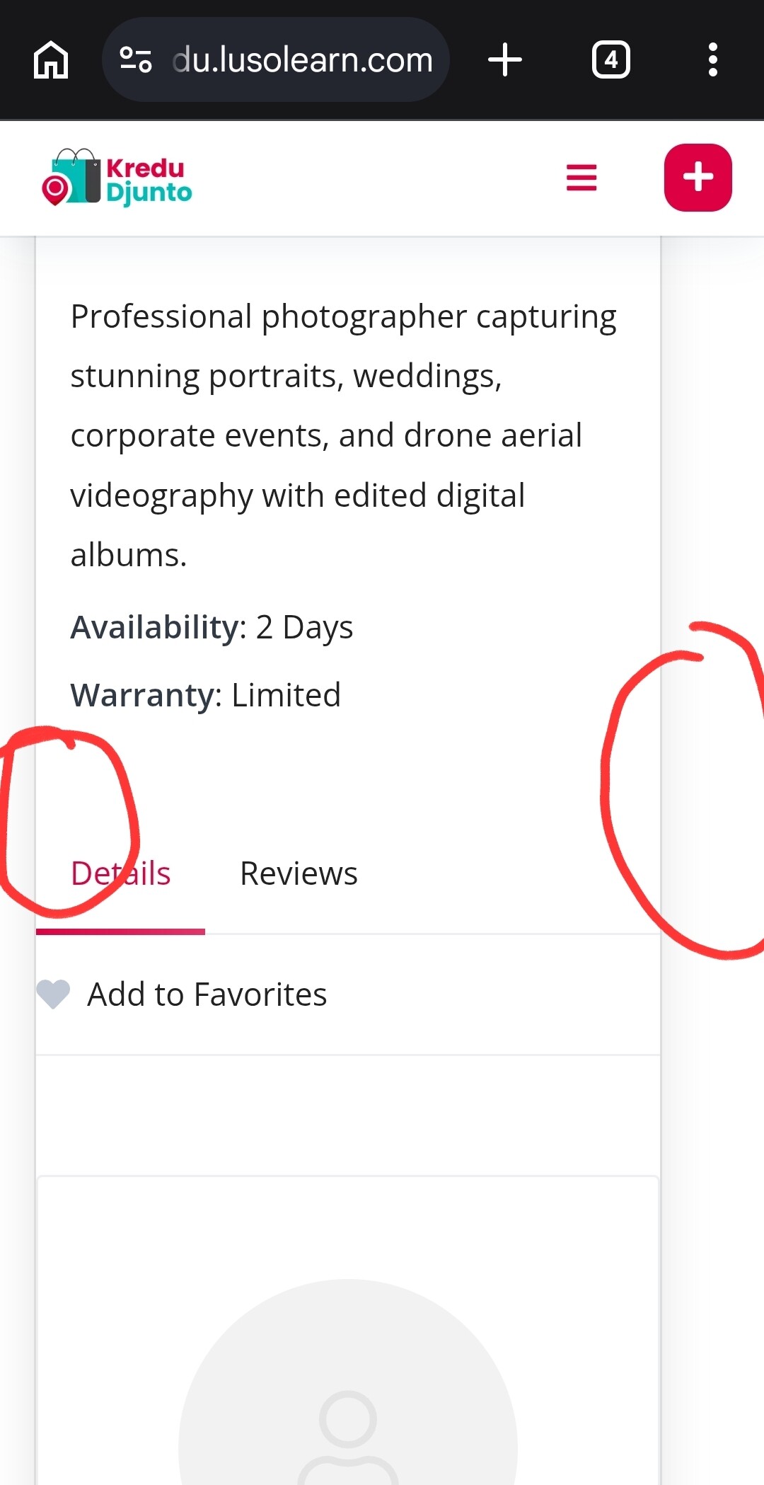
I noticed the margins are unequal on certain pages. This is easily fixed though, and will look far more professional once corrected. You could also consider using Loco Translate to change the ‘Add to Favourites’ action label to ‘Favourite/Unfavorite’ in order to try and get the actions all on one line for a cleaner look.
Thanks for the kind words, and for sharing the theme with the community!
In addition to the detailed feedback from Chris above, I just wanted to mention that we’ve noted some of the changes in our backlog, so similar improvements may become available in ListingHive as we aim to make it mobile-first. We’ve also been considering creating an app-like version of ListingHive using Vue.js.