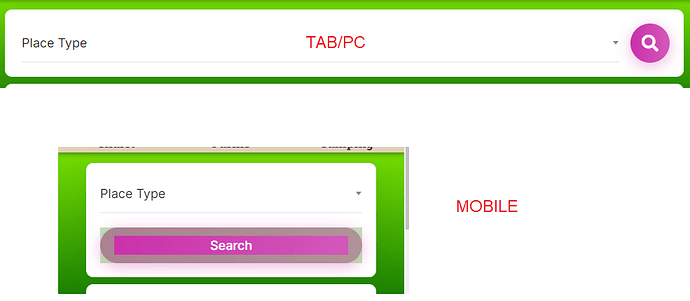
please provide css snippet for search form button
i have only one search filed, i want search button(icon) beside the field even in mobile screen as it is in tab /pc mode
(switch off stackable(flex) on mobile)
Awaiting for your reply.
Sorry for the inconvenience, but customization is beyond our support scope - it includes fixing bugs and guidance about the available features Support Policy | HivePress
If customizations are required for your site, please try customizing it using the collection of code snippets Search · user:hivepress · GitHub and other developer resources, or consider hiring someone for custom work https://fvrr.co/32e7LvY
This is not customization, users feeling inconvenience of big buttons and filed padding issues on wide screen of Samsung z fold phones.
Hoping to get support.
I didn’t find any snippet / customization service in the links you provided. Please help it is essential for site.
Sorry for the inconvenience, but customization is beyond the support scope. It includes fixing bugs and guidance about the theme functionality. Also, the button is displayed in the same way on the theme demo site, it’s advertised this way before the purchase - it doesn’t overflow the layout, contain incorrect text, block scrolling, or form submission (these would be bugs within the support scope). If you believe that using an icon or text on both desktop and mobile layouts would improve the mobile UX, please suggest this improvement in Feature Requests (you can list all the possible mobile layout improvements you noticed).
This topic was automatically closed 30 days after the last reply. New replies are no longer allowed.
