Drawing inspiration from this topic ( Two-Column Layout for Listings in Mobile View ) but with some further modifications, I managed to reach a working code that displays the listings on the homepage for mobile view on two columns:
However, while this works for the listings on the homepage, if I click on one of the main Categories, the listings on that new page are again displayed on only one column on mobile, just like the listings in the “Related listings” block. I tried targeting it a bit more specific with code like this:
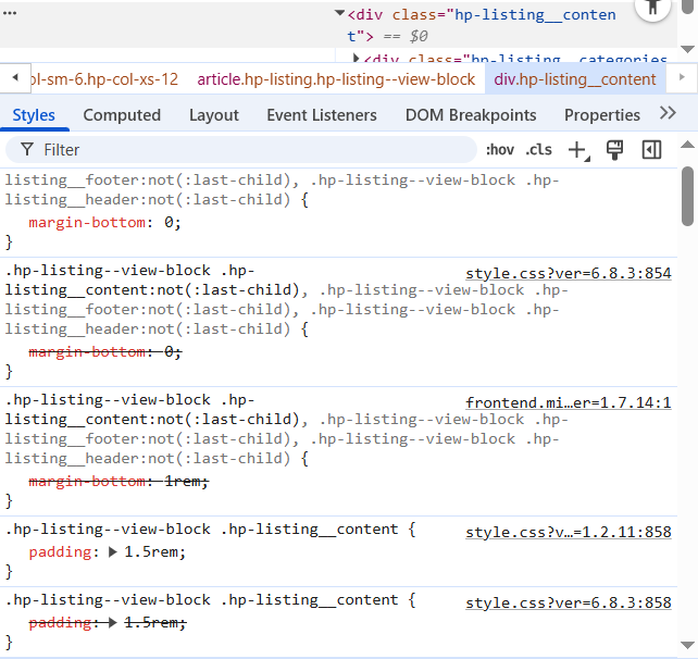
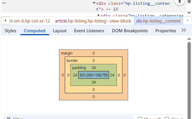
, but it still doesn’t work. When I inspect the page, I can see the theme’s grid.min.css is applying flex-basis: 100% to the .hp-col-xs-12 class, and my custom CSS rule is not overriding it, even with !important.
I have already cleared all caches and tested for plugin conflicts. Do you have any suggestions? Thanks a lot!
I’m not on my computer at the moment, but try simply removing body.home from the code snippet you shared first. That part is telling the code to only apply to the homepage. Therefore, in theory, removing it should apply the fix sitewide as you wish.
Let us know if that does the trick!
Edit: you can also try removing the .home reference in the snippet Andrii shared in the other topic.
This was a brilliantly easy fix - not sure how I didn’t think about it, but thanks a lot, it fixed it!
I do have one small issue now however. Following the same logic, I went ahead and deleted the body.home from all the other CSS snippets I had for formatting the listing blocks and almost everything worked fine (text sizes, block margins, etc..) on the category pages/related listings too; but, I am not able to “copy over” the CSS I have for padding.
So far, the rule I am using to align text inside the blocks (title, secondary attributes) is leveraging the hp-listing__content hook:
While this works for the homepage, it doesn’t work for the category pages. The weird thing about this one is that if I strip the “body.home”, the padding remains broken on the category pages, but it also breaks on the homepage. Not sure what is causing this behaviour, as removing this from all other snippets worked fine.
Please try experimenting with different CSS selectors using the Inspector tool in your browser. This will help you identify the correct element to target for your styling needs.
You can start with .hp-listing--view-page .hp-listing__content.
Please note that we’re unable to assist with custom CSS modifications, as this falls outside our support scope. If you need advanced styling adjustments, we’d recommend reaching out to an expert who can help you achieve the desired look.
I understand - not expecting HP support to look that deeply into such custom things, but I was hoping that maybe another member of the forum would have come across this issue or could easily identify the culprit (similar to how @ChrisB brilliantly spotted the first one).
Update - I managed to fix the category-page view by adding the following snippet:
The issue was the selector was not specific enough - instead of “body.home” I had to target the right selector for the category pages, which was the .tax-hp_listing_category.
Now I only need to also find the selector for the “Related listings” part to fully fix this.