Hi, guys!
I noticed that some elements of mobile and desktop are in positions that don’t’ let the right experience. Follow some cases:
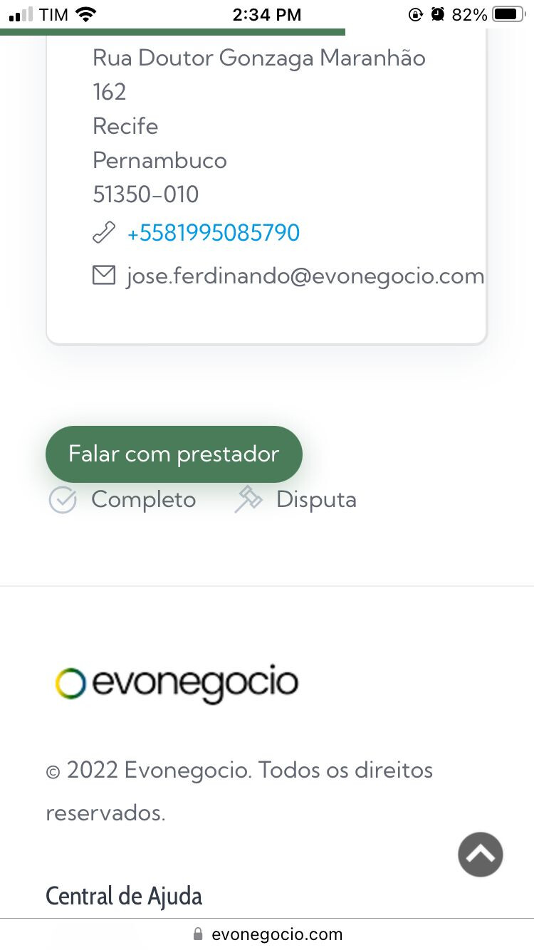
In this case, the buttons are very close. Can you let the buttons more distant one to the other?
This problem happens on order page of user, at mobile.
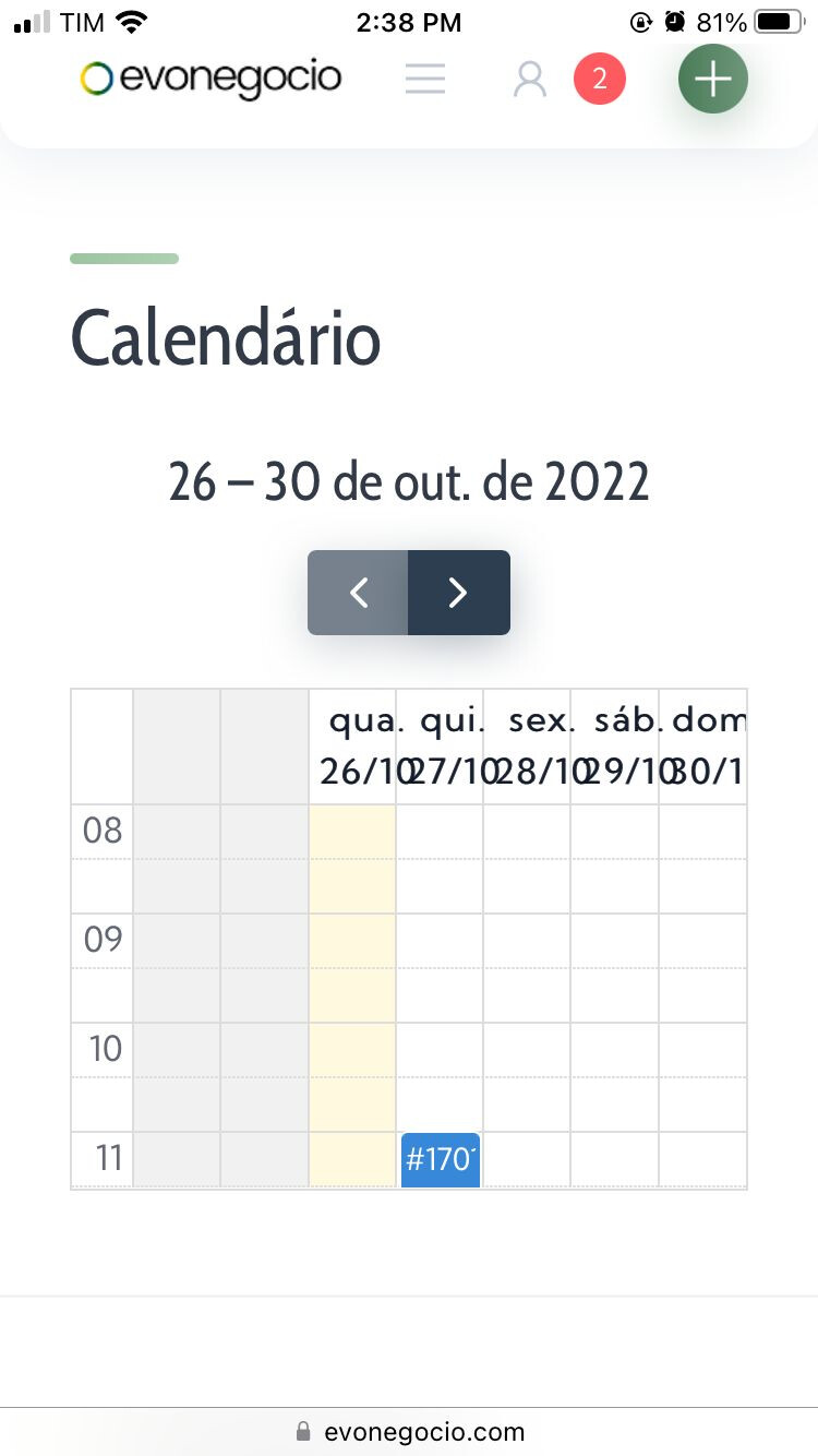
Here, in the calendar, I can’t see the days. One day stay under the other day.
The issue happens at mobile
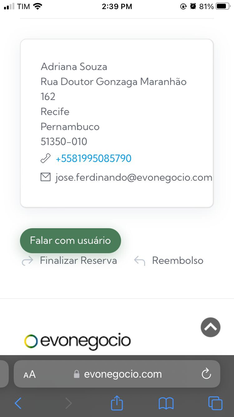
Here, the problem is the same of the order page of user, just that here, happens on order page of vendor
In this case, the buttons are very close. Can you let the buttons more distant one to the other?
In dashboard, in graphics, I can’t’ see the month and the day. One month and one day be under the other month and other day.

Finally, in arrows at the images on listing, doesn’t exist an icon. Both in desktop both mobile.

I appreciate your help.
If you need something, tell me!