tomp
September 23, 2022, 2:03pm
1
Hello,
I used the following CSS I got from this forum to make a Video Embed fit 100% width on the Listing Page.
@media screen and (max-width: 74.99em){
	.hp-template--listing-view-page .hp-listing__attribute iframe{
			width:100%;
    }
}
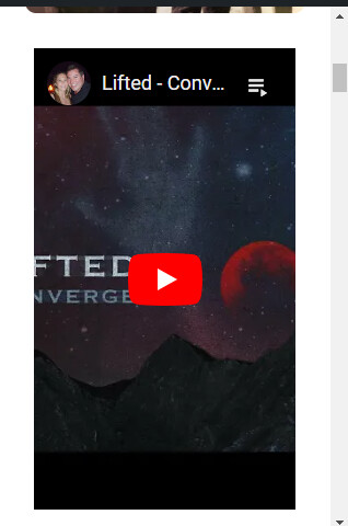
However on mobile it centers the video 100% but the video width stretches past both ends as seen below:
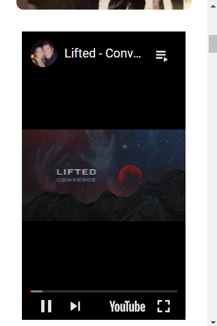
I would like the Embed Video to appear like this like when after you hit play:
Is there something I’m missing in the CSS?
Thanks,
1 Like
ihor
September 24, 2022, 2:26pm
4
Please try using a temporary CSS fix suggested in this topic How to make video embed responsive?
tomp
September 24, 2022, 2:44pm
5
Yea, that’s the topic I got the CSS snippet from and it works on desktop but on mobile you can see it stretches past the width of the screen. I want it to come up like the second screenshot I posted after you hit the play button on a video.
yevhen
September 25, 2022, 6:28pm
7
Please try this CSS snippet to start but please note that it can require further customization
@media screen and (max-width: 74.99em){
	.hp-template--listing-view-page .hp-listing__attribute iframe{
	    width: 100%;
		height: 300px !important;
    }
}
tomp
September 26, 2022, 12:27pm
8
That helped Yevhen thank you
1 Like
system
October 26, 2022, 12:27pm
9
This topic was automatically closed 30 days after the last reply. New replies are no longer allowed.